三旋供应链,创建于2017年中国成都,火锅的发源地。三旋作为TOP10火锅品牌餐品定制的服务商,目前在中国已为超过5000家火锅品牌门店提供一站式菜品服务,被行业评选为“中国餐饮百强供应链企业”。
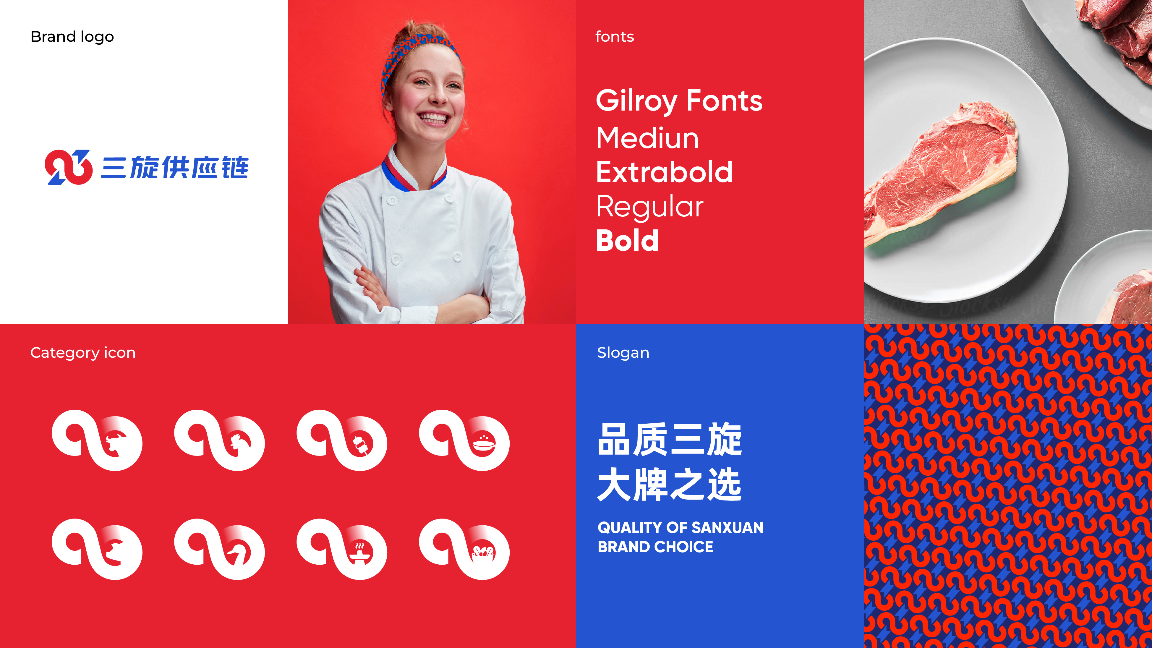
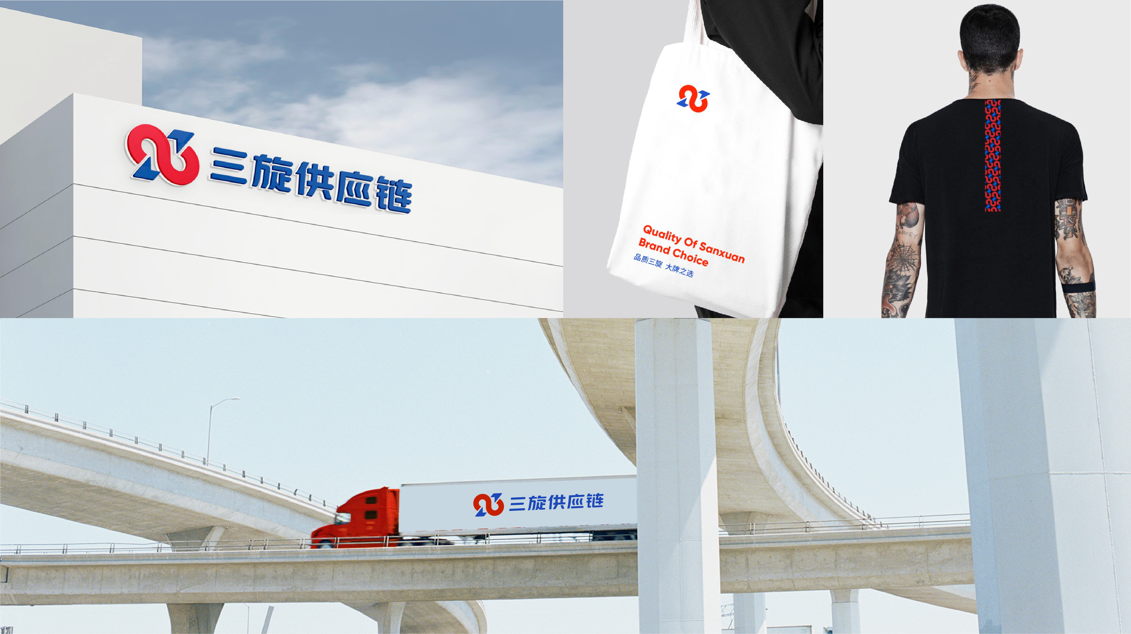
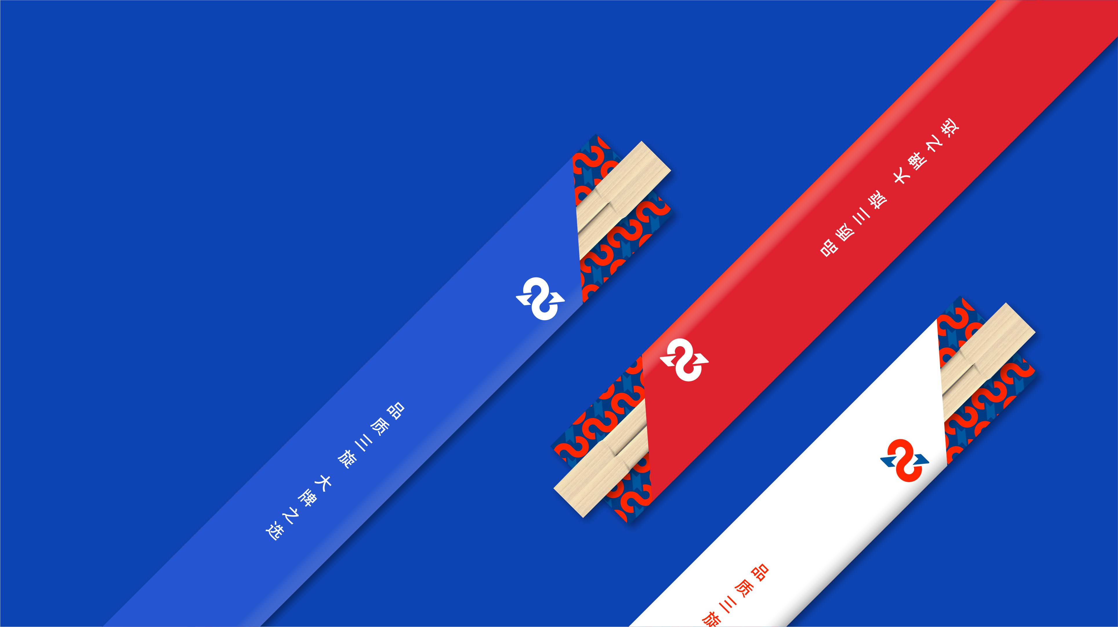
全新的品牌标识由两个“3”旋转构成一个无限符号。数字3和中国汉字的三相对应,可以增强图形与汉字之间的关联,更易识别;而两个3构成的无限符号,体现了三旋活力无限、成长无限的团队文化,也呈现出三旋品质无限,服务无限的精神追求。我们在颜色上使用红蓝双色代表食品和供应链均衡的能力。
客户:三旋供应链
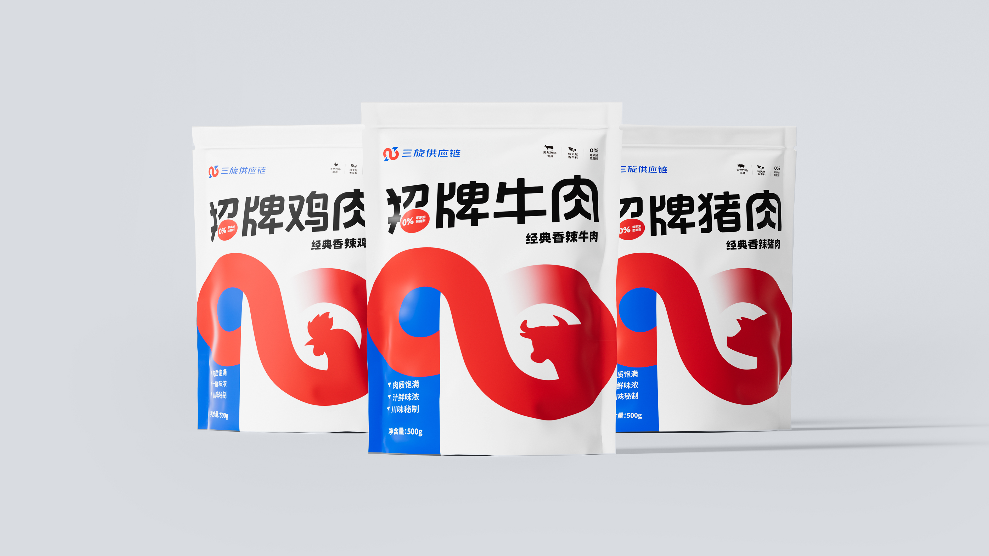
项目内容:品牌视觉全案 / logo设计 / VI设计 / 包装设计
创作时间:2022年12月01日

行业背景
三旋供应链,创建于2017年中国成都,火锅的发源地。三旋作为TOP10火锅品牌餐品定制的服务商,目前在中国已为超过5000家火锅品牌门店提供一站式菜品服务,被行业评选为“中国餐饮百强供应链企业”。
Industry Context
SANXUAN Supply Chain, established in 2017 in Chengdu, China, the birthplace of hot pot, has served as a one-stop dish provider for more than 5,000 hot pot brand stores in China and was named "China's top 100 restaurant supply chain companies" by the industry. SANXUA is a Top 10 hot pot brand meal customization service provider.
挑战
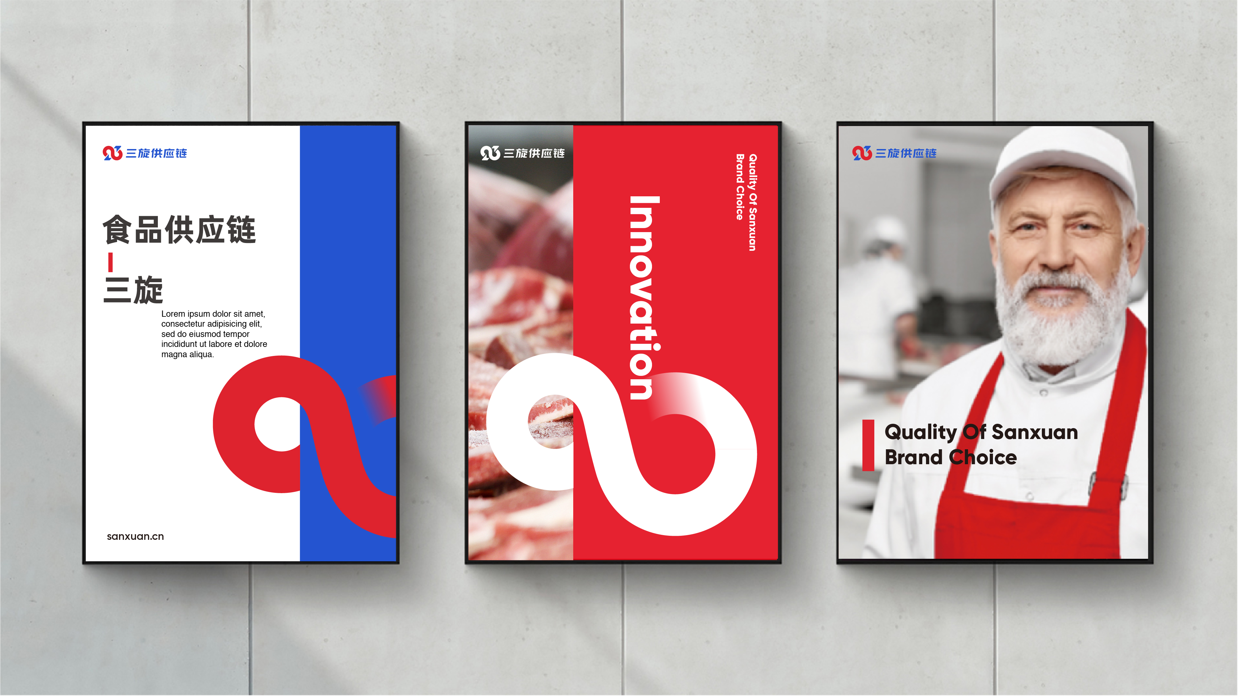
在中国餐饮快速品牌化的今天,源自于成都的火锅餐饮品牌遍布中国大街小巷,为了快速抢占市场,他们需要像三旋供应链一样的食品供应链企业,帮助他们研发更美味、更便于制作、更快送达的菜品。在新的机遇面前,三旋发展迅速,但随着公司规模的不断发展,三旋逐渐意识到:对火锅品牌来说,虽然物流履约能力很重要,但“食品品质”同样重要,在这个领域三旋具有自身的独特优势。为了能让客户感知到,三旋希望通过全新的视觉形象向他们展示三旋供应链在食品研发、品质把控、生产制造、物流运输等多种优势为一身的一站式服务能力,更好的助力餐饮品牌快速发展。
Challenge
Hot pot catering brands from Chengdu are widely available on the streets of China in today's quick branding of Chinese catering. They require the assistance of a food supply chain firm like SANXUAN to help them create more delectable, simpler to prepare, and quicker to transport foods in order to quickly seize the market.
SANXUAN expanded quickly in response to new opportunities, but as the company's scale continued to grow, SANXUAN gradually came to the realization that for hot pot brands, while logistics fulfillment capability is important, "food quality" is equally important, and SANXUAN has its own specific advantages in this area. In order to better support the rapid development of restaurant brands, SANXUAN intends to make clients aware of its one-stop service capabilities in food research and development, quality control, manufacturing, logistics, and transportation through a new visual image.

策略
为了深刻了解食品供应链,我们对三旋的中高层进行了数次访谈以了解三旋目前的行业位置,结合餐饮行业及国内外竞品进行了深度的资料收集及整理,确定了三旋以“品质无限”作为最大的品牌差异点进行视觉表达,并期待三旋以行业领导者的身份,提升餐饮品牌效率的同时,让消费者吃到更有品质的美食。
Strategy
We conducted several interviews with SANXUAN's senior and middle management to understand the company's current industry position, along with the restaurant industry and domestic and international competitors, to gather and organize in-depth information. We came to the conclusion that SANXUAN would use "unlimited quality" as its most distinctive brand feature for visual expression, and we anticipate SANXUAN to be the industry leader to increase the efficacy of the food supply chain.

创意
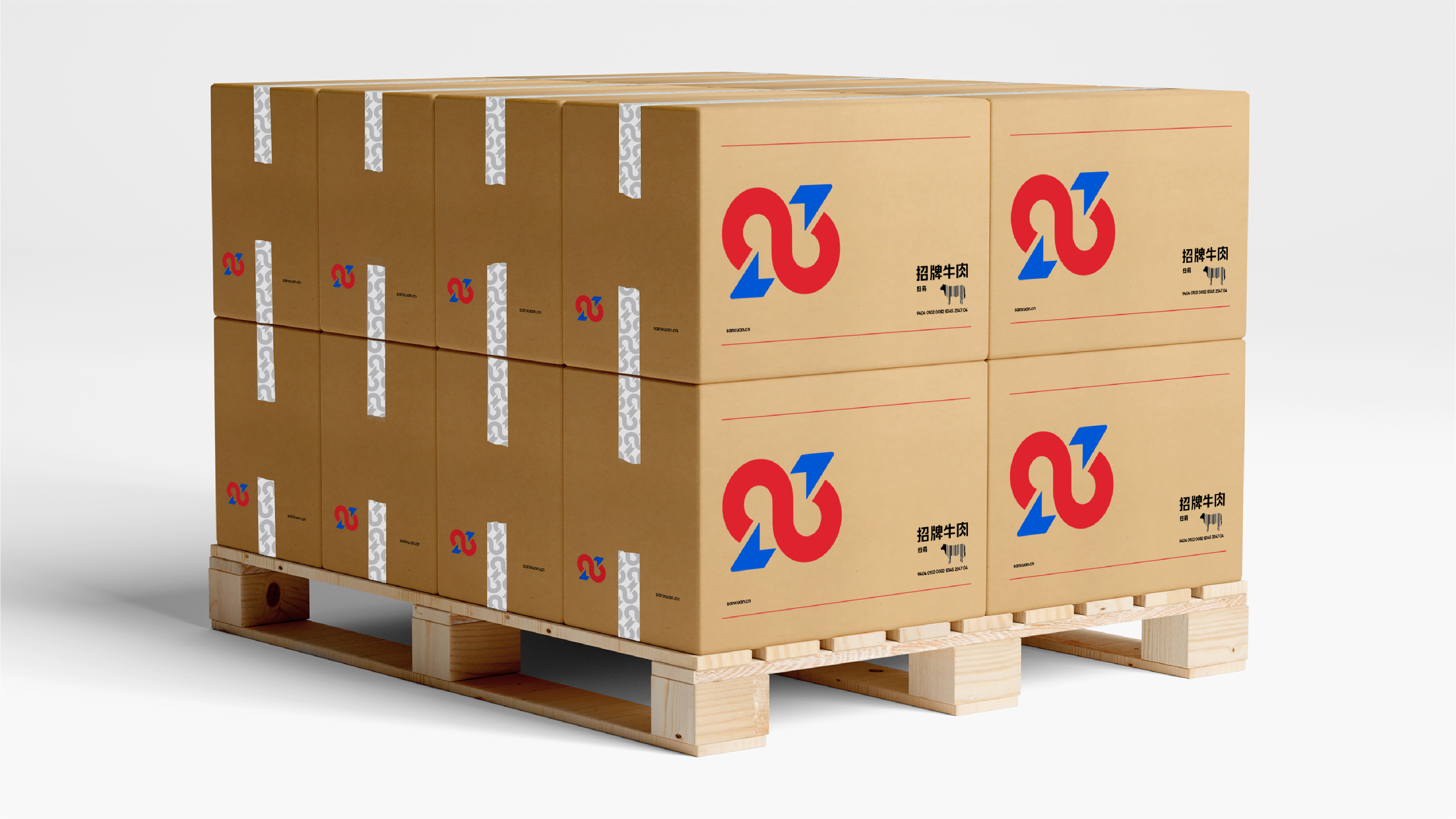
全新的品牌标识由两个“3”旋转构成一个无限符号。数字3和中国汉字的三相对应,可以增强图形与汉字之间的关联,更易识别;而两个3构成的无限符号,体现了三旋活力无限、成长无限的团队文化,也呈现出三旋品质无限,服务无限的精神追求。我们在颜色上使用红蓝双色代表食品和供应链均衡的能力。
Idea
Two "3" rotate to form an infinite symbol in the new brand logo. The Chinese character "" is echoed by the number "3," which can strengthen the connection between the graphic and the Chinese character and make it simpler to recognize. The infinite symbol created by two 3s also conveys SANXUAN's values of unlimited quality and unlimited service. We use the colors red and blue to symbolize the harmony between the ability of food and the supply chain; the blue arrow represents the supply chain, and the red hue represents food that is delivered to consumers through it.
成果
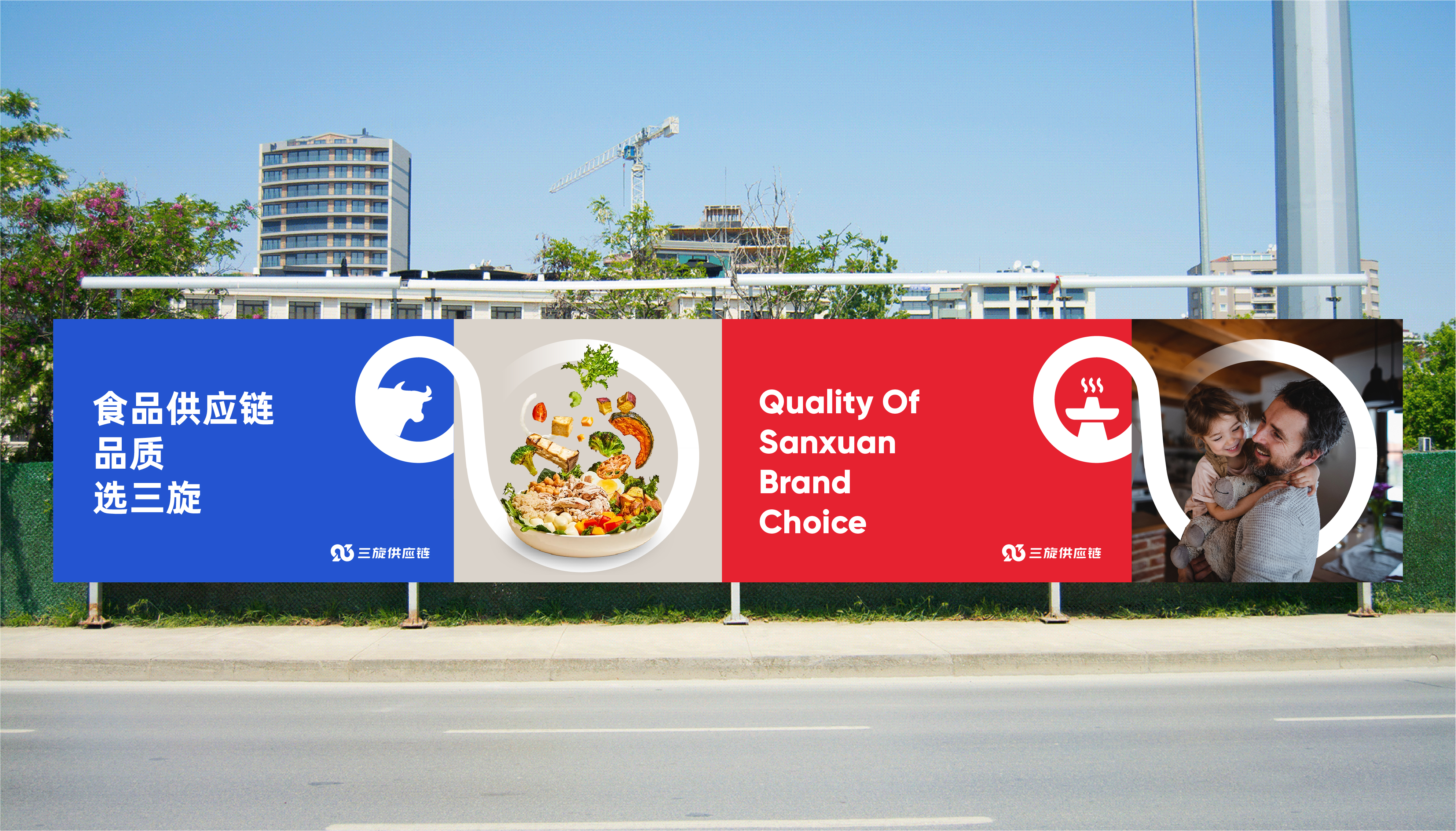
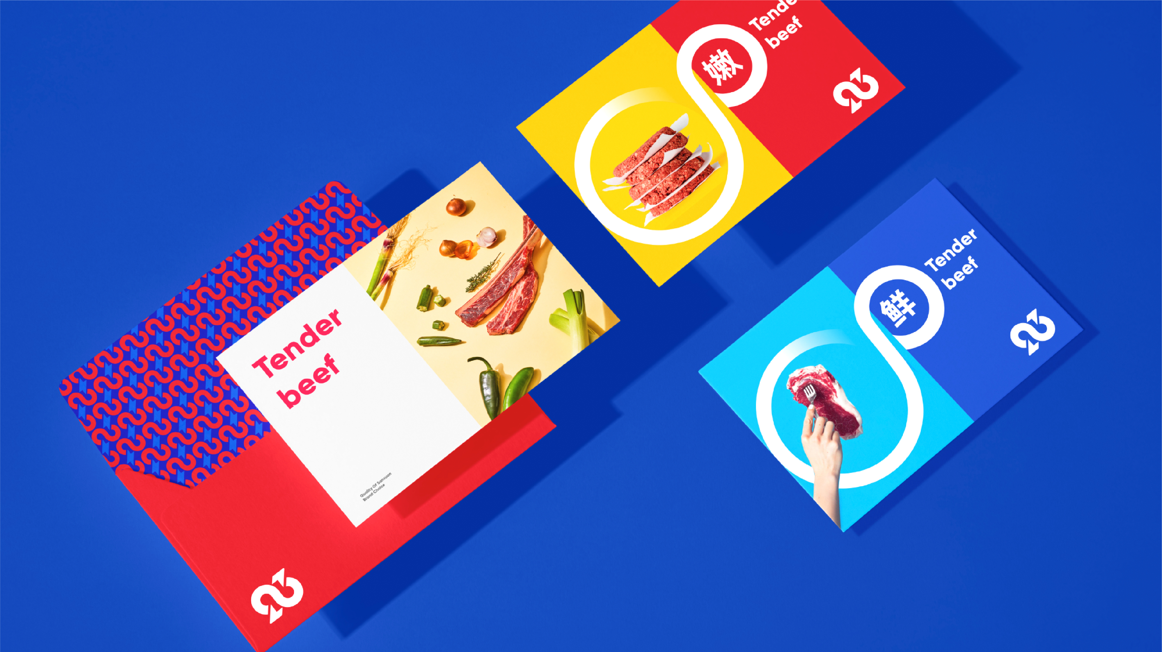
兼具“品质感”和“服务感”的全新三旋形象于2022年12月对外正式启用,新形象揭开了三旋的全新篇章,保持足够行业差异度的同时,引领三旋团队走向更美好的明天。
Results
In December 2022, SANXUAN's new brand identity—which embodies both "quality" and "service"—was formally unveiled. This new image ushers in a new era for the company and inspires the SANXUAN team to work toward a brighter tomorrow while still retaining a strong level of industry distinctiveness.
始终坚持打造菁英团队,保持专业
找最棒的人,做最棒的事
Do The Best