探路者童装是中国户外用品市场的领军品牌—探路者旗下的童装品牌。 探路者童装以极地科技打造高品质、可信赖的儿童户外产品,为生而好动的孩子们提供安全舒适的户外“铠甲”,助力小小探路者们勇敢地探索世界。产品聚焦户外运动,安全、舒适、绿色,童趣自然,引领儿童户外生活方式。
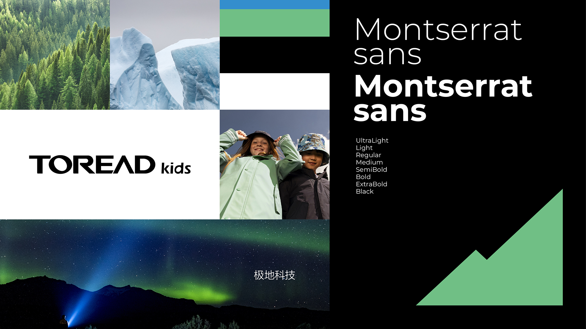
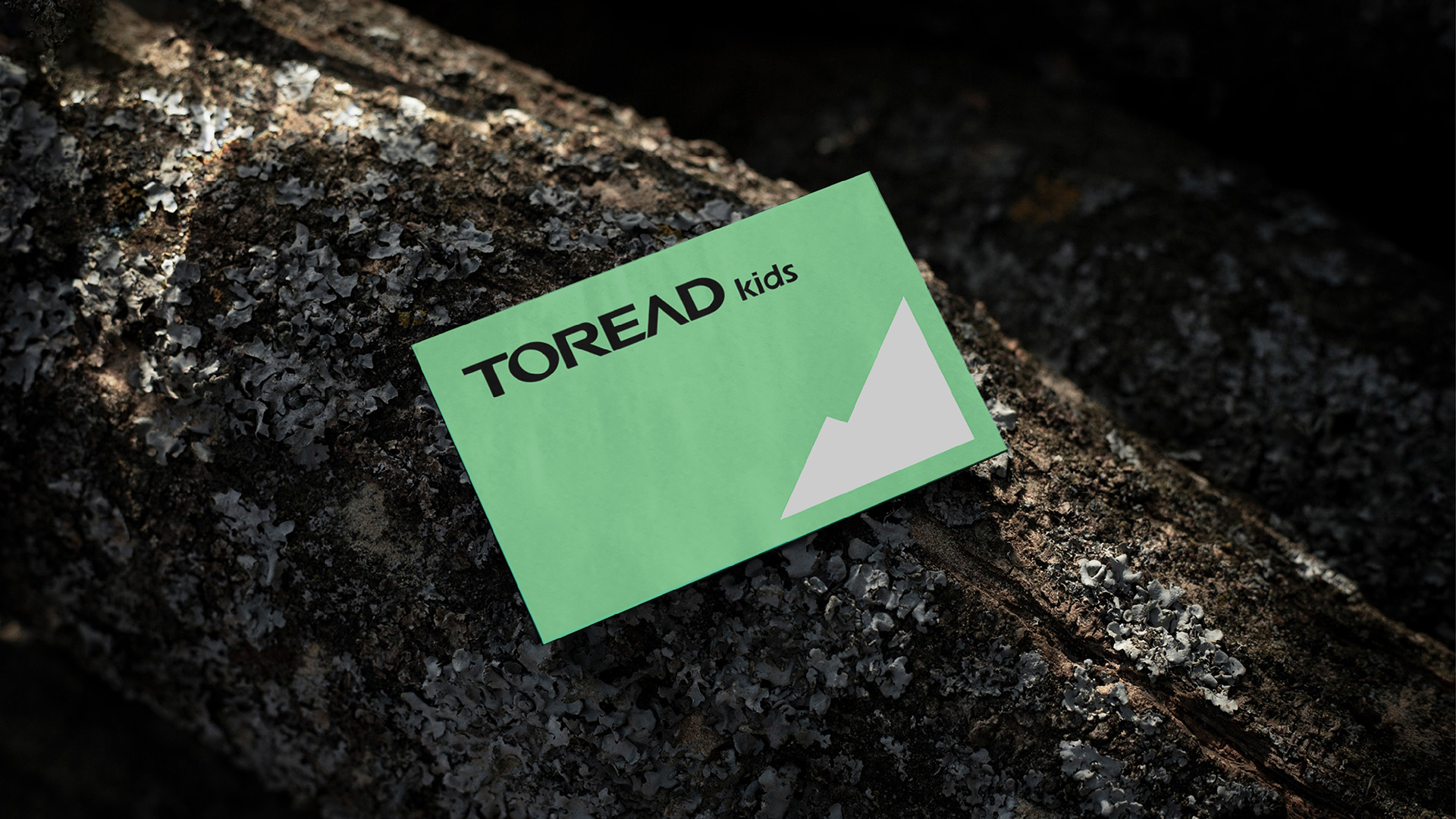
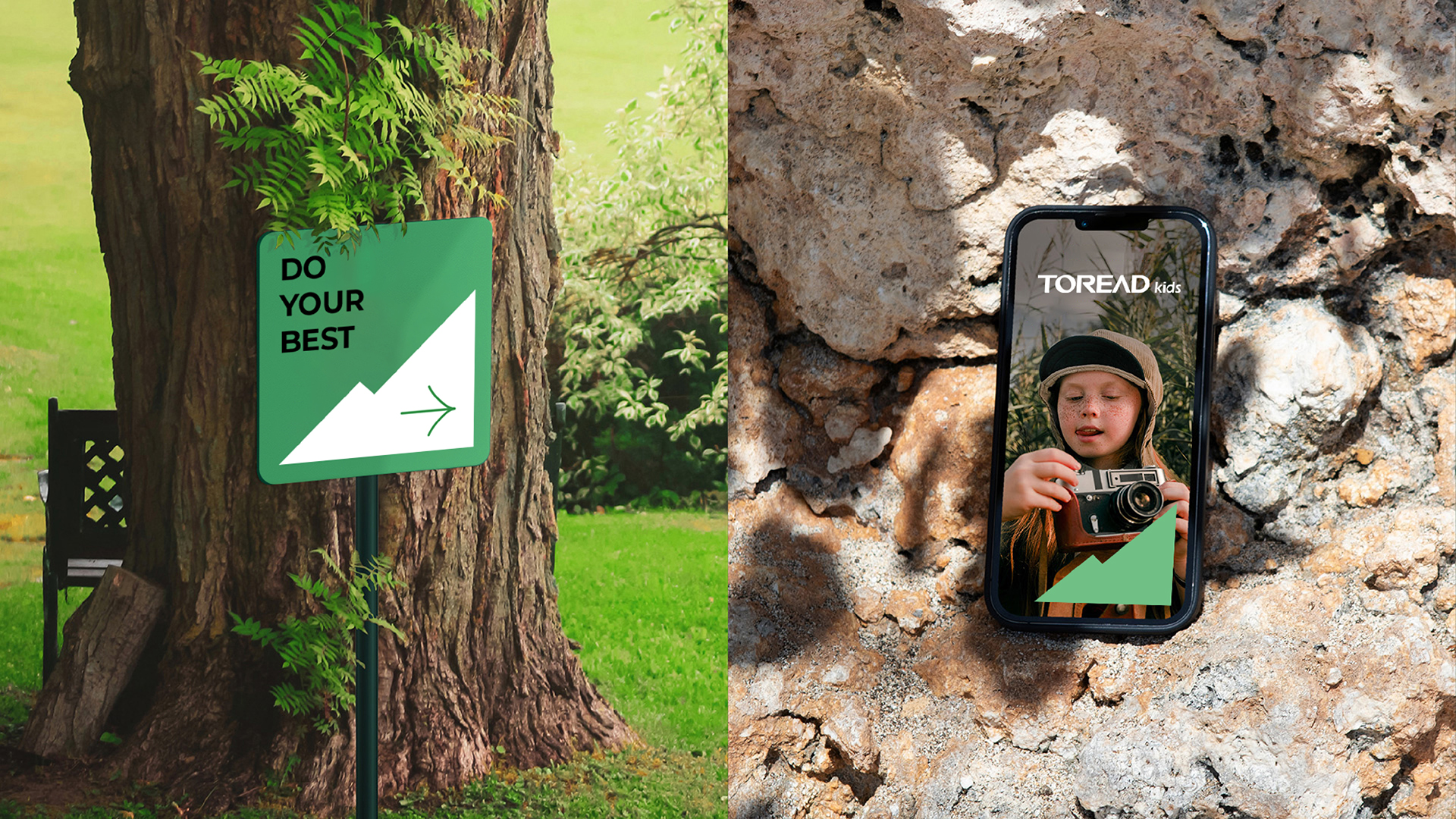
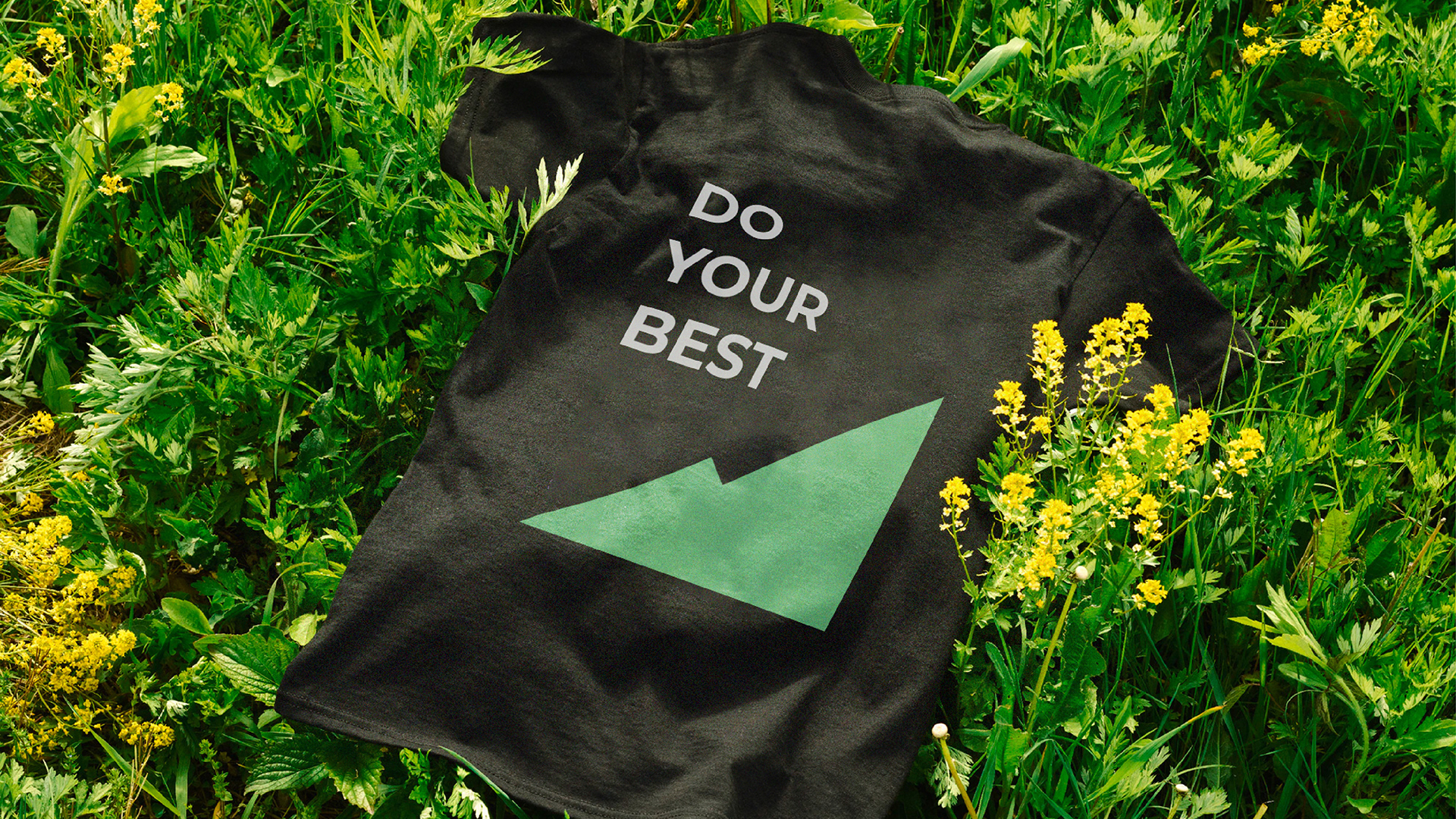
全新的视觉系统从“极地仿生科技”出发,“取之自然,用之自然”,将以极地直观联想的山峰造型作为核⼼的符号延展,同时融合代表自然成长的树的外观,兼顾童装⾃然童趣和产品极地科技的特点,发展⼭峰树木两种元素合⼆为⼀的形式作为符号语⾔,并把上述符号体系加⼊童装春夏和秋冬款的落地物料,配合具有区分感的绿⾊和蓝⾊,打造核⼼符号突出季节特点的综合视觉体系。
客户:探路者童装
项目内容:VI设计 / 品牌咨询管理 / 线上设计
创作时间:2022年11月28日

行业背景
探路者童装是中国户外用品市场的领军品牌—探路者旗下的童装品牌。
探路者童装以极地科技打造高品质、可信赖的儿童户外产品,为生而好动的孩子们提供安全舒适的户外“铠甲”,助力小小探路者们勇敢地探索世界。产品聚焦户外运动,安全、舒适、绿色,童趣自然,引领儿童户外生活方式。
Industry Context
The Pathfinder children's clothing brand is a well-known name in the Chinese outdoor apparel industry.
Pathfinder children's apparel uses polar technology to provide high-quality, dependable children's outdoor items for the energetic youngsters born to provide safe and comfortable outdoor "armor" to support the little pathfinder courageous to explore the world. Products emphasize outdoor activities, are secure, cozy, environmentally friendly, entertaining and natural for kids, and promote an active outdoor lifestyle.

挑战
在儿童户外服装持续增长,发展潜力十足,但同时面临品牌品类繁多,品牌同质化严重的市场环境下,探路者童装市场定位逐步走向品牌中高端化;在此契机下,探路者童装需要重新构建全新的差异化的视觉以使品牌脱颖而出,焕发新的生命力。
Challenge
Pathfinder children's clothing market positioning gradually towards the high-end brand as the children's outdoor clothing industry continues to expand, full of development potential but at the same time facing a wide range of brand categories, brand homogenization is a serious market environment; in this opportunity, Pathfinder children's clothing need to reconstruct a new and differentiated vision to make the brand stand out and give new life.
策略
为了深刻了解户外童装品牌的市场,我们对探路者童装做了深入的研究,并对市场成功品牌做了完整的视觉调研,最后以“极地仿生科技”作为最大的品牌差异点进行视觉表达,形成视觉体系的核心语言。
Strategy
We studied the Pathfinder children's clothing in-depth and conducted a thorough visual analysis of market-leading brands in order to fully comprehend the outdoor children's clothing market. Ultimately, we decided that "polar bionic technology" was the most important brand differentiator for visual expression and served as the basis for the visual system.


创意
为了继承主品牌的品牌资产,我们从“极地仿生科技”出发,“取之自然,用之自然”,将以极地直观联想的山峰造型作为核⼼的符号延展,同时融合代表自然成长的树的外观,兼顾童装⾃然童趣和产品极地科技的特点,发展⼭峰树木两种元素合⼆为⼀的形式作为符号语⾔,并把上述符号体系加⼊童装春夏和秋冬款的落地物料,配合具有区分感的绿⾊和蓝⾊,打造核⼼符号突出季节特点的综合视觉体系。
Idea
We began with "polar bionic technology" and "took and used nature" in order to inherit the brand assets of the primary brand. The mountain shape, which is intuitively associated with the polar regions, served as the center's core symbol, and the tree's appearance, which symbolizes organic growth, was integrated to balance the children's clothing. The two aspects of peaks and trees are integrated into one symbolic language by taking into account the qualities of children's clothes and arctic technology,and the distinguishing green and blue hues are added to the base materials of children's clothes in the seasons of spring, summer, and autumn/winter, together with the above-mentioned symbolic system, to form a comprehensive visual system with the central symbols highlighting the traits of the seasons.

成果
全新的品牌体系于2023年5月对外正式启用;新的视觉体系承载了探路者童装助力小小探路者们勇敢地探索世界,引领全新儿童户外生活方式的美好愿景,助力品牌更好的发展。
Results
The new brand system will be formally introduced in May 2023. The new visual system conveys the vision of assisting young adventurers in discovering the globe and fostering a new outdoor lifestyle, which will aid in the brand's growth.
始终坚持打造菁英团队,保持专业
找最棒的人,做最棒的事
Do The Best